
A Good Idea Gone Bad: The Sad Story of a Failed IKEA Makeover
Sometimes our heads make promises our bodies can’t deliver. What seems like a great idea on paper might turn into an eyesore in reality. This is the story of a failed IKEA makeover that seemed so promising in my mind but never worked out the way I wanted.
My mind’s eye saw regal perfection: a grand glorious thing, resplendent in royal blue and shimmering hammered copper. It was almost too beautiful to comprehend. It would be the crown jewel of our home – a proud testament to my visionary genius, and I was sure that no matter where it was placed in the house, it would be bathed in golden ethereal light. The gods would see to it. Such a marvel would surely attract their divine eyes, and they would want to gaze down upon it, always. They would probably want to shower its creator with wealth and fame and power.
Wait.
I’m getting ahead of myself.
First I need to make it.
The piece I wanted to transform was a Hemnes 5-drawer chest from IKEA. I called it Big Red, and it stood in our kitchen for a time holding batteries and Band-Aids and rawhide bones. You’ve seen it before in my DIY In-Wall First Aid Cabinet post.
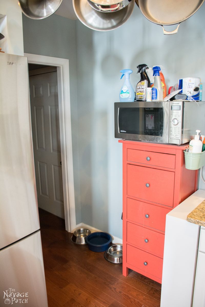
Big Red wore a shameful crown: a filthy microwave littered with cleaning products. He could be so much more, if only he could pull himself from that lousy neighborhood. The space was cramped, and he had to share it with a canine feeding station. The indignity! He deserved better.
Later, I gave a makeover to a baker’s rack that Handan wanted. You can read the amusing circumstances of that encounter here: Click here to learn how I was rudely awakened and forced against my will to drive my wife to buy a used baker’s rack!
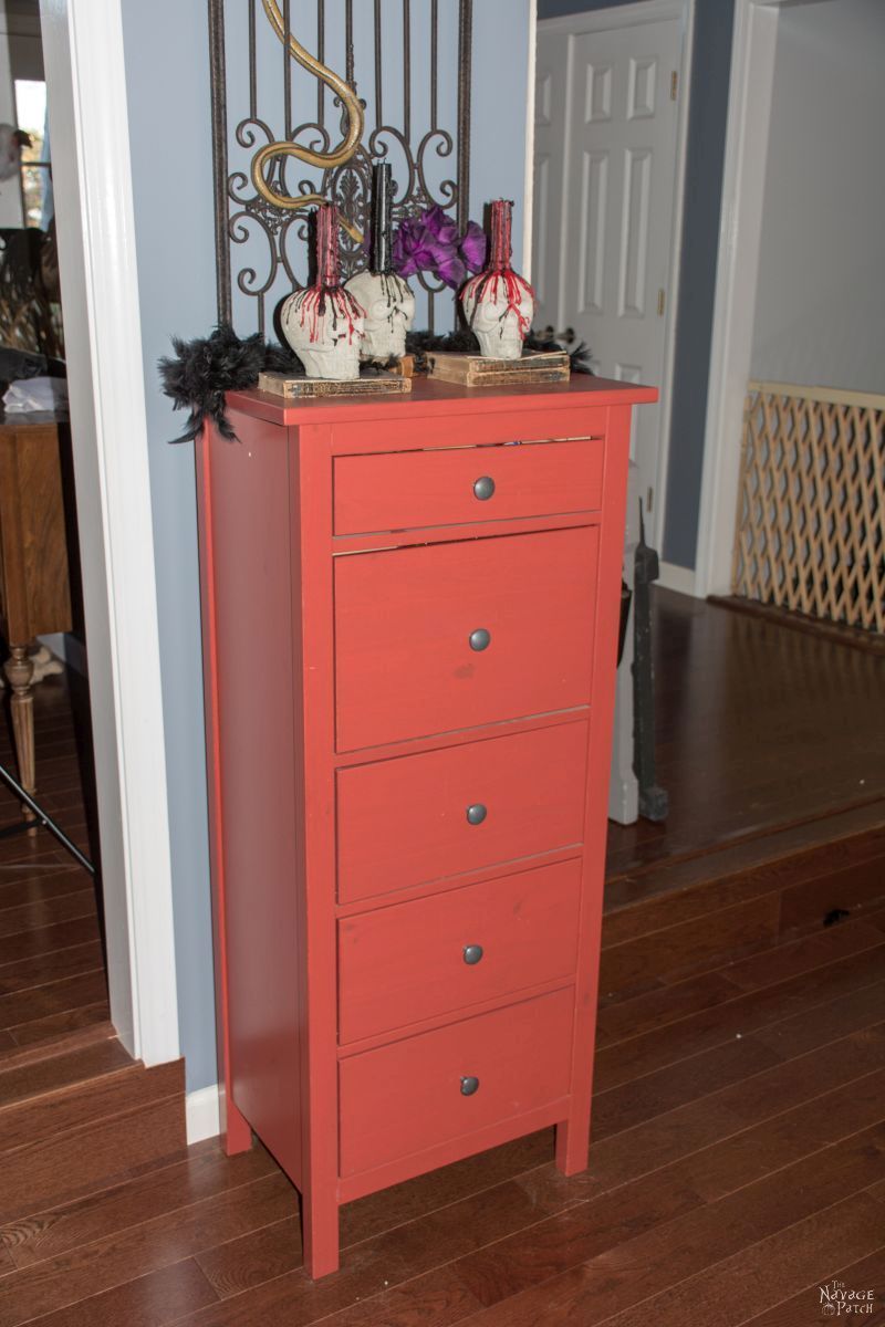
Once that baker’s rack was finished, Big Red was served an eviction notice. He was down on his luck and didn’t have anywhere to go, so I plopped him in the dining room, figuring he could stay there until he got his act together. A month passed, and Halloween rolled around. Big Red saw some action as a staging area for Handan’s Concrete Skull Candle Holders.
It looked like my temporary dumping ground was becoming permanent. That suited me just fine. It meant I didn’t need to carry it anywhere else! I figured everyone else in the house was A-Okay with Big Red’s new home, too.
I was wrong.
As usual.
Handan didn’t like it. Oh, she didn’t like it one bit.
“Hey babes!” (You know what those words mean.) “Hey babes, why is this stupid thing still here?” She stood in the dining room, her left hand on her hip, right arm outstretched, finger pointed directly at Big Red like a mirthless judge passing down a death sentence. [LOL – sometimes I’m really amazed with your imagination my babes! – Handan]
She wasn’t happy.
“Ummmm….” My brain scrambled for a defense like a matchbook lawyer late for trial. “Your Honor, er, my babes – I was gonna, I mean, what I’m trying to say, is that, ummm, I was planning on doing something with it.” That’s it! the angle I needed to win the case, or at least escape with the minimum sentence. “Yeah, that’s right! I’m planning to give it a makeover, my babes! Just you wait and see…it’s going to be awesome!”
“Hmmmm.” She’d heard it before. Like a junkie promising to quit tomorrow. “Okay, my babes. We’ll see what you come up with.”
Phew! Hehehehe…wormed my way out of that one pretty-
“Now get it out of here!” Her tone brooked no argument. I jumped from the sofa, gave her my most milquetoast “yes, dear,” and hauled Big Red to the basement.
It may not surprise you to learn that Big Red sat in the basement, untouched, for a number of weeks.
I didn’t have a plan. I didn’t know what to do. Handan pummeled me with wave after wave of Pinterest ideas, but I poo-poo’d them all. I had a vision for it. Well, I actually didn’t have a vision at all, but I knew that I would eventually have a vision. I hoped.
And then one day, as I sat scrolling through Hometalk, I stumbled upon a skull. It was painted bright copper, and its eyes were a shimmering, glimmering blue. It was beautiful, and I knew right then and there what I wanted for Big Red. I had my vision!
I searched for “copper sheets,” found a supplier, read about all the sizes and thicknesses and patinas and then placed an order.
Oh boy, this is gonna be great!
I stood at the mailbox and awaited my delivery.
My plan was to cover the top and the drawers of Big Red with a copper sheet, hammer it, and then let it form a natural patina over time. I’d paint the frame a deep, royal-ish blue, as that color looks great with copper. And the knobs would be painted with the same blue that the Hometalk woman used to paint the skull’s eyes. It was a metallic blue called Peacock. I found it on Amazon and ordered a small bottle.
Some days later, my copper arrived, and I ran to the basement to begin my project.
I disassembled Big Red and laid out the pieces I’d need to work on.

I figured the drawers were a good place to start since they were small. For the insides of the drawers, I grabbed a random Annie Sloan blue that we had kicking around. I thought the lighter Annie Sloan blue would contrast well with the darker royal-ish blue (that I still didn’t have). It was my first time using Annie Sloan.
I had heard from the entire DIY community online that Annie Sloan’s paint was so awesome that you didn’t need to sand or clean or do anything before using it. It was supposed to stick to anything. I watched videos of people painting dirty furniture and crowing about it. Hmmmmm.
Well, my IKEA wasn’t dirty, but it did have quite a factory finish on it. Smooth as oiled silk. Well, all those crows couldn’t be wrong, could they? I would employ Handan’s style of painting – applying several very thin coats – to increase my chances of proper adhesion.

Four coats later, it was time to move on to the main event: copper.
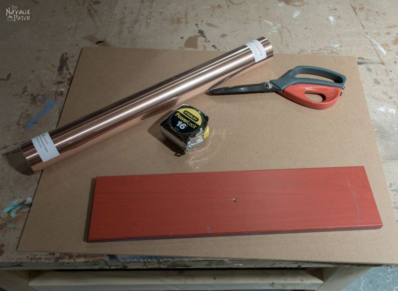
My plan was to cut the copper sheet large enough that it would wrap around the edges. I measured, marked and cut the sheet.


There are special adhesives made for copper, but who the heck has time for that? Construction adhesive would surely do the trick!

Then I laid the sheet, starting from the back and wrapping around to the front.

I clamped it all up and let it cure overnight.

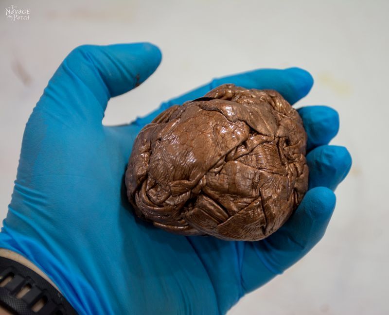
And that is that last picture you’ll see of the copper. When I checked on it the next day, there were air pockets where the sheet hadn’t properly adhered to the drawer face. There were glue marks, and places where the copper had creased. It looked awful. Hideous. It was an embarrassment to the copper mining industry. My dream was dead. I pulled off the copper, and in the process, discovered that Annie Sloan did not, in fact, stick to everything. It started to flake off anywhere it was touched. That meant I’d have to sand the whole piece. Nuts to that! This project was over.
Dejected, I pushed the drawer pieces to a corner and left the carcass standing at the edge of my workshop.
It stood there, abandoned, until Handan and I were shopping at Home Depot one day. While she was browsing the spray paints, I was checking out some of the specialty paints. I saw a can of Rustoleum Hammered Copper paint. Not spray paint, but the kind you brush on. Oil-based. It looked interesting, and it gave me an idea for my IKEA project. Maybe instead of real copper, I could use that Hammered Copper paint? It was worth a shot.
I sanded the top so the paint would stick.

For the drawer faces, I tried a few different strippers and deglossers.

The strippers didn’t eat through the IKEA factory finish very well, so I decided to degloss them (and the carcass) and hope for the best. I really didn’t want to sand the whole chest, so the deglosser would have to do. The Klean Strip was the best of the bunch.

The Rustoleum Hammered Copper paint is really cool stuff. You just brush it on and then watch as it magically transforms the brush strokes into hammered copper.
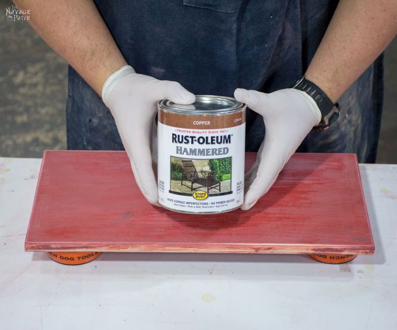


I painted two or three coats on the drawers and left them to cure.
Meanwhile, I started painting the top. I went a little heavy with the paint up top and learned a valuable lesson with this paint: it takes a loooooong time to cure if you glop on too much.
A week after painting, I wanted to touch up an area I wasn’t totally happy with. I put my paintbrush on the top and taped up the sides of the carcass. When I finished taping, I grabbed the brush, but it resisted when I lifted it.
“Awwwwww, crap!” I knew exactly what had happened. I looked at the top and saw a big dent where the brush had been. It had been a week, but the brush sank into that paint like it was quicksand! I tried sanding, but that just made a gunky mess, so I got a heavy-duty scraper and peeled off the top.

There was a lot of paint.
After peeling and scraping, I sanded and prepared to paint it once again.

I really should get into product modeling, don’t you think?
Anyway, I slapped on a few more coats, and left it to cure.
During that curing time, the weather warmed up, our outdoor projects came fast and furious, and my little hammered copper project was again forgotten. It was only this December, while Handan and I were doing some major cleaning and de-cluttering, that I got the notion to finally finish the project.
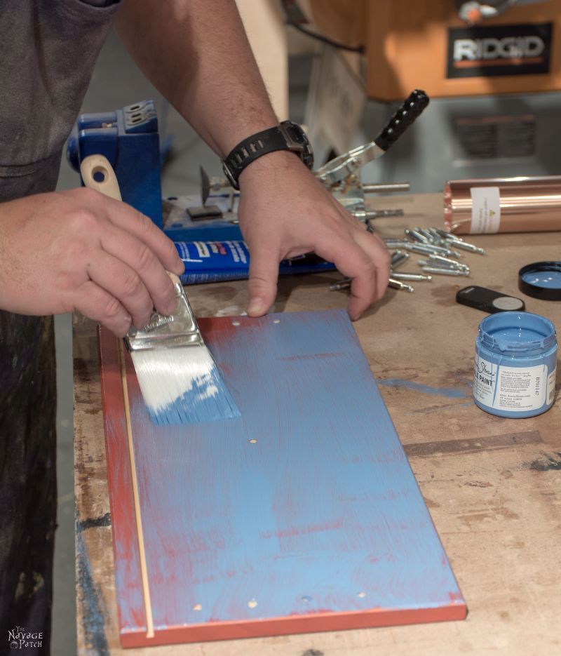
Handan had recently bought some Fusion paints, and one of the colors caught my eye. It was a rich blue color that seemed perfect for my project. Over a year had passed since I had started this project, and I just wanted to get the thing done and out of my hair. I no longer had any aspirations for the chest. It wouldn’t be the crown jewel of the house. It wouldn’t be bathed in ethereal light. And the gods would likely have a good chuckle when they saw it. Still, it could make a storage chest for the basement, so I soldiered on. I didn’t take pics while painting. I figured I’d snap a few at the end and be done with it.
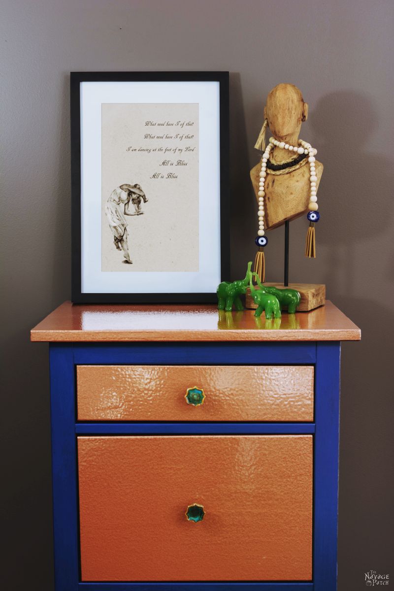
But you know what? I was starting to like it more and more as I painted. I loved the blue and copper together. When I had it all painted, I rummaged up the original drawer pulls. I had always planned to use that Peacock metallic blue paint on the pulls. I was convinced it was going to look awesome. I painted them…

When they were dry, I re-assembled the chest.
I loved it. Really, I did. At that moment, and for several moments after, I truly loved that piece of furniture. It might even earn a place upstairs, I thought!
I took a couple of pics in the basement. The lighting wasn’t great, but it would be good enough for Handan to see. I sent them to her over Skype and awaited my praise.
(These cell phone pics are really dark. The blue is lighter than that.)


The praise never came. Instead:
“Ok.
“It looks pretty good.
“Not the best.”
And then she changed the subject.
How could she not love it? I loved it! And I was determined to share it with the world so others could love it, too!
But she had planted a wicked seed of doubt, and over the next couple of days, my loving looks turned to doubtful glances. Maybe she was right? It does look pretty stupid. I mean, where the hell would we put it? Handan especially hated the metallic blue pulls, but they were my favorite part! They made the whole project!

How could I be so blind? How could I love it so much if it was really such a turd in the punch bowl?
We called my sister to arbitrate. Margo agreed with Handan that the pulls had to go. Dammit. Two against one. But I’m a grown man, and I can admit when I’m wrong. Or outnumbered. So the pulls would go. Margo liked the rest, though, so there was that.
Handan and I went to Hobby Lobby to look for pulls. We bought an assortment and brought them home to try. One set of pulls stood out above all others. Instead of calling attention to themselves like the peacock pulls (which was the point, in my opinion), these pulls were subtle, and they allowed the copper to take center stage. I liked them, and I understood that they were necessary if this thing were ever to meet the public in our house. I took a few staged shots, still uncertain of my project’s fate.
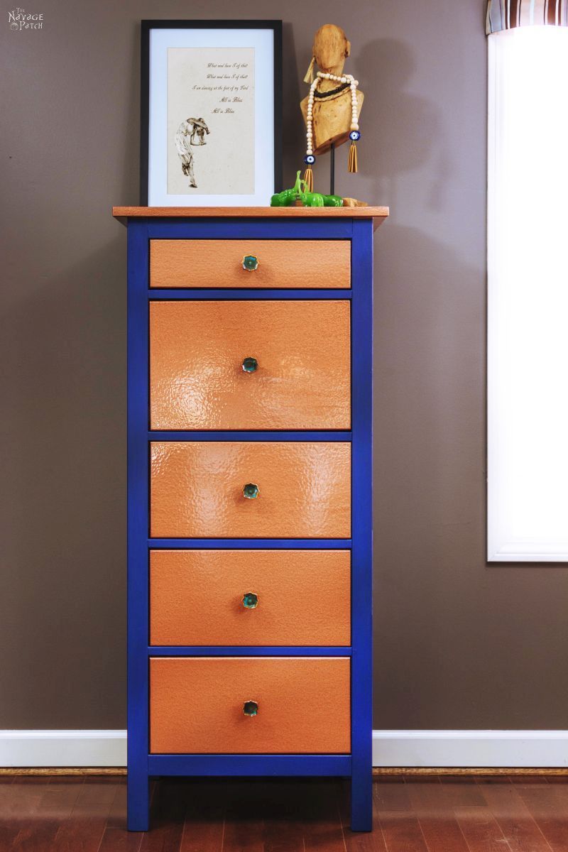
After I took these photos, I understood that this makeover had no place in our home. I knew that Handan didn’t like it, and I didn’t want to force it on her. Truth be told, I’d been liking it less and less each day. So I decided to chalk it up to a learning experience and a chance to try out a couple of new products. I love the Rustoleum Hammered Copper paint, and I’ll try to find another project for it in the future. I also liked the Fusion paint. It was easy to work with, and it seems to be sticking where Annie Sloan couldn’t. It’s expensive though, so it’s not for everyday use!
And if nothing else, this project gave me another excuse to write a few words for you guys to read. Blue Copper (as he’s now called) has moved back to the basement, but not for long! Handan has big plans for him. No, no, not how he is now. She’ll be stripping him bare and giving him a new makeover. Stay tuned to learn his fate!
Now, before you go – do you have any makeovers that didn’t go as planned? Disasters? Unintended successes? Anything out of the ordinary, heartbreaking or hilarious? Send me some photos at greg@thenavagepatch.com, and include a little story. If I can get enough participation, I’ll put out a post of your disasters and stories!
I really like Blue Copper! While I love the colour of the original handles I don’t think it went the other blue. Maybe a darker blue paint (almost black) with the copper would have made a difference . As it is, I wouldn’t kick it out of my house!
Thank you, Giselle! I’m happy to hear that I’m not the only one who likes it, lol!
I’ve been loving copper and dark blue recently. The new pulls are so nice and I think you have me an idea for my own chest.
Thank you, Lauren! I’m glad it has inspired you – it has served a good purpose!
I really like blue copper. Even with the original pulls! Send him on to my house. I have a whole bunch of places he can proudly stand. Ok, maybe still no golden lights of glory from above but happy to meet the public. Lol! Seriously though. The chest looks great, whichever pulls are on it.
Thank you so much, Missy! I was hoping that someone would agree with me on the Peacock blue knobs, lol! 🙂
You cracked me up, Greg! I just love your writing style. The copper finish looks beautiful and goes so well with the blue. I agree with Handan and your sister on the old pulls. The new ones were a great choice though.
Thank you, Julia! Wow, with all these comments, Handan almost reconsidered her choice to makeover Blue Copper. Almost. 😀
Almost! 😉
??? You guys are so freaking cute and funny! I enjoy reading yalls blog because its funny, helpful, but most importantly REFRESHING! A breath of freaking fantastic fresh air! Thats not an over the top compliment, because , gosh darnit, its the truth! So there, enjoy all of that! Lol. Happy Tuesday Navage Patch! And….Goodnight! ✌?
Thank you so much, Allison! You just put a big smile on my face! I’m so happy to hear that we offer something different here at The Patch – that’s the best compliment of all! Happy Wednesday, Allison!
I love love love the original makeover! I think you did a great job with the colors and the copper paint. Poo poo on the naysayers!
Thank you, Jeanne! You are obviously a woman of refined tastes 🙂
Hilarious! I love your blue and copper project but I love copper. And every project we do doesn’t go as planned! We think a job will take a day and cost under $100. SEVERAL days and WAAAAY more than $100 later we’re done. It always looks great but seldom how we originally envisioned it.
Thank you, Sue! Yup, your projects sound exactly like ours, lol!
Greg, Your story-telling style with humor is AWESOME! You paint such great word pictures! Thank you for showing us the hammered copper paint finish; I have never seen it used before. I love your fistful of peeled off paint! Thank you for showing us your “failure” which still looks darn good to us newbies! I have had several discouraging failures and I’ve said, “I’ll never try that again.” Till next time!
Thank you so much, Kathy! Yes, that copper paint is awesome. I’m glad you liked my little failure 🙂
Love reading your posts!!!! Always get a good chuckle, as you are a very entertaining writer! The copper and blue look good, but not my colours. I have refinished a few pieces of furniture and not all go as planned, much like this one, lots of sanding and repainting…
Thank you, Louise! Yeah, the sanding is always the worst part. It goes on forever!
I really like the copper with the teal…maybe the dark blue needed to be the teal of the pulls?? I actually like your original pulls better than the green ones…and I love both teal and green! The copper is amazing – thanks for the intro to Hammered Copper paint!!!
Painting the whole thing in peacock – now THAT would have made a statement! I think it would look amazing, but it certainly wouldn’t fit with our decor 🙂
I liked the original peacock pulls! I had a misguided chalk paint project that I tried to wax. Everything said waxing was easy. Then I learned why my grandmother was so happy to get a no-wax floor. Waxing is NOT easy. But the little table turned out cute.
LOL, Handan would agree with you! Actually, so would I. Waxing is never easy, lol!
I really like it, and I think Handan should look again with her accent chair next to it. Or make another with the blue embroidery if it doesn’t clash (blues are hard, I know). You could tone down the blue with a tinted wax but I do think it is lovely.
Thank you, Derry! We’ll see what happens to him, but for now he’s resting comfortably in the basement, lol! 🙂
I like it! And as always, I love your storytelling 🙂
Thank you, Barb! 🙂
Whoa!! My husband just made a copper roof for our cupola and topped an antique table and…I luv them. WAIT…that probably wasn’t the “best thing” to tell you… Anyway, I’m sure I can come up with “some” project that didn’t work…hmmmm…..franki
LOL, thanks, Franki! Email me a picture of the table – I’d love to see it! (and tell me how he glued it on)
I love your storytelling!!!! You could write a kind of ” DEAR ABBY” Column.
Thank you, Cheryl! Yes, I SHOULD be giving more advice to strangers! Hehehehe…
You are a great storyteller. I Love the color combination that you used. That’s the first time I have seen copper paint. It’s amazing. Thank you for your story.
You’re welcome and thank you, Anne! 🙂
Love the story telling!! You should write a book— Trials of a DIY Man You style is very much like Jean Sheppard in The Christmas Story.
I love that movie! There’s also a YouTube recording of Jean reading the short story on the radio back in 1974. Really fun to listen to. https://www.youtube.com/watch?v=GkicEleOiTM
I like the original makeover although the darker blue looks a little too dark and “grayed” out; a bold, azurite hue would be great. I really like the metallic pulls. Hell, if it had been me, I’d have painted the whole thing copper and the metallic blue. Then again, I’m the one who wants Mexican tile in every room.
Funny story. Most makeovers, I get halfway through them and think “here’s another fine mess you got me into, Ollie!”
LOL, I know the feeling! I have that sinking feeling almost every project I do!
Well,I love it too. I also had not seen copper paint actually used. It is lovely! But gooping it on so you had to take it all off…I thought you knew better! ?YOU’RE the experienced one here! And look at all those tools,clamps ,sanders…you could have had a ball deconstructing,destroying……
Oh well..impatience pays the price! My hubs is the..”it’s good enough “kind. I grit my teeth. Our beautiful bathroom cabinet is now chipping because he used flat paint,and didn’t protect it with poly or anything. But I have no other serf or minion to do these things,so I walk on tippy toes sometimes,to get SOMETHING done! But yours sure looks good to me! Waiting for the next reveal! ?. Bernice
Bernice, your husband sounds a lot like me, and you are very much like Handan, lol! I think he and I would get along great! 🙂
Oh this is hilarious! I am reading your post on my phone so am not getting a whole screen at a time. So I start reading the comments above and thinking..this is what I was going to say..everything with hubs is good enough! Aarrgghhh! Then I read the name ..and it was me! Holy cow!!! What can I say?
LOLOL! 😀
I wish I had your resolve on finally deciding on pulls. Shopping for pulls is like being a kid in a candy store; I can’t never decide on just one! On my last furniture project, I must have purchased and returned close to 30 and I ended up double face taping my final selection to the drawers because I’m still looking for the ‘perfect ones’! Re the Ikea makeover itself, I LOVE hammertone finishes but I think any copper paint on furniture just looks too fake (unless it’s just an accent i.e. like the bottom of a leg to imitate a metal band); there’s nothing like a real copper hammered look. I hope you’ll find somewhere else to use the real copper 🙂
We’re the same way, Sara – that’s why we buy 5 or 6 sets at Hobby Lobby. Whatever we don’t like, we return. I guess it’s harder to do that with online stores, though, lol! As for the copper – I’ll find something to do with it. Maybe I’ll make small hammered copper bowls or something.
I love it with the new pulls – they are very eye catching, and still capture the peacock-ness (can that be a word?) of the ones you painted. I haven’t had great experience with AS paints, but chalked it up to operator error (see what I did there, lol).
Thanks for sharing what worked and what didn’t, and I love your story telling! I want to try the hammered paint now that I see an actual end result. I wonder if you could mold the glob you took off into a ‘copper’ sculpture you took off – sort of a monument to DIY successes and failures 🙂
Thank you, Patty! I’m happy to meet another AS skeptic! And yes, peacockness is a perfectly lovely word. I’m going to start using it myself 🙂
I agree! A monument glob! Front and center! ?
Beautiful job and great story telling. I am definitely going to use the hammered copper paint on something. I enjoy reading your blog and seeing your projects.
Thank you, Cathy! You’re going to love that paint!
Not shock at all that this turned out so fabulous, because that the type of work you two produces. I love this peice, and thanks for tge fab tutorial
Thank you so much, Ivory! 🙂
Love your story. I used the hammered paint but in the silver to do my bedroom set about 8 years ago and I love it! It looks amazing on furniture…..hides all imperfections and has that shimmering look to it. My set is French Provincial…I just left off any pulls…simply answer to a ‘hard decision’…lol…
Chalk Paint…OMG…don’t even get me started…I TRIED my first time on a dresser turned media cabinet that i DIY this summer….it took me at least 6 coats and it STILL did not cover the piece like it said it would…I finally resorted to latex paint.. I used ‘real’ chalk paint.not homemade. I don’t think chalk paint is all it’s cracked up to be….( I even sanded and cleaned the piece first). I was SO pissed off and frustrated at the whole experience…it almost made the dresser my dad’s winter wood burning project. Glad to hear I am not the only one who had BAD luck with chalk paint and it is not as smooth and everyone says it is.
I like your copper project and I am thinking that my bedroom set needs a NEW makeover….I am going to be doing a bedroom makeover and that just might be a GREAT idea…HMMMM??..
I have that hammered silver, too, but I haven’t used it yet. Can you send me a pic of something you painted with it? greg@thenavgepatch.com
I totally hear you about the AS chalk paint, and Handan feels the same way. But you know something? The chalk paint that Handan makes is way better than AS! She posted a recipe for it way back in the early days of our blog. Here’s the link, in case you’d like to give it a try: https://www.thenavagepatch.com/homemade-chalk-type-paint-recipe/
She swears by it!
I love it! I’d buy it as is!
Thank you so much, Robin! I knew it wasn’t so terrible, lol 😉
Oh my goodness! I’m amazed at your stick-to-it-ness!!! I would have thrown in the towel long before it became a thing of beauty!
I look forward to your writing and new projects!
Also, could you share where that lovely print came from? (What need I have of that…)
P.S. Handan’s recipe for chalk paint really is the best!
Thank you so much, Lynn! Here’s the link to that printable: https://www.thenavagepatch.com/what-need-have-i/
I LOVE it!! I LOVE everything about it! I was so sad when I read Hansen didn’t share my enthusiasm. If I lived closer I would offer you car loads of cash!
Good Job Greg!
For car loads of cash, I think I can arrange a delivery 😀
I see that my phone auto corrected sweet Handens name, my apologies!
She’s been called worse, lol!
Wow, I got pulled into your blog through Pinterest. So many projects and interesting things to read. And thank you for sharing material lists, i.e. the lighted waterdrop. Needless to say, I signed up, so not to lose sight of you
Thank you, Iris, and welcome to The Navage Patch! We hope to hear more from you in the future! 🙂
Oil paint takes forever to dry. Kilz would have worked for you. No sanding required. And they can tint it at the Depot. Why not use copper faux metal adhesive? A lot easier.
Next time – Kilz it is!
I live it! Maybe it’s because I love colorful things but I would buy this if I saw it in a store! Good job!
Thank you, Paola!! 😀
I really like this too !! I’ve also wondered how the metal sheets worked out It’s a great idea but they don’t work like they advertise. I no longer wonder. ?